Symbols are all around us and our recent article on the acid house smiley face – Does the Smiley still pass the acid test? – got us thinking about how different images affect us and how their meanings can take on new life over the years. So, here’s our list of 4 symbols that have evolved from how they were once perceived, good or bad, to how they are seen today.
Emojis
As a ‘97 baby, I straddle the line between Millennial and Gen Z, but I definitely identify more with Gen Z trends. I don’t wear skinny jeans, I’m addicted to TikTok and I’m VERY particular about my use of emojis. Why? Because 13 year olds on social media told me so!
There’s a longer history to the emoji than you might think, but when I was in school, during the days of Bebo and MSN we used to call emojis ‘emoticons’, and some of my firm favourites were (L) (meaning love), :L (which meant I was laughing) and </3 (which meant heartbroken, awww). All pretty straightforward, right?
But as time has gone on, the symbols we use when we text have gotten just a litttttle more complicated. The laughing crying emoji isn’t cool anymore, now we use the skull. The glitter emoji isn’t just a nice sparkle, it’s used for emphasis and often means sarcasm. There’s loads more, so if you’re a Millennial or above, and don’t want the Gen Z’s in the office making fun of the way you ✨emote✨ then make sure to brush up on the latest emoji dictionary.
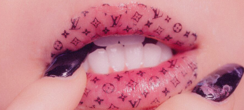
Logomania
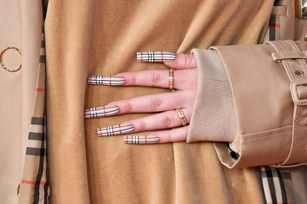
You may not have heard of logomania before, but you’ve definitely seen it. It’s the fashion trend of wearing pieces; often clothing, handbags, hats and even nail designs, with big and bold luxury fashion monograms printed all over. Some may think of its excess use as a symbol of wealth, and some might just see it as tacky but it’s a trend that’s risen, fallen and risen again since its prominence in the early 80s.
But not many know how the phenomena came to be…
In the 1980s, Harlem-born haberdasher-turned-fashion designer, Dapper Dan would become famous for illegally printing luxury brand logos such as Gucci, Fendi and Louis Vuitton onto garments and selling them to the general public for an affordable price. Calling his pieces ‘knock ups’ rather than knock offs, his monogram-centric designs were picked up initially by ‘hustlers and street people’, including the infamous drug dealer, Alpo Martinez. He also found success with popular 80s and 90s rappers such as LL Cool J, Salt-N-Pepa and Bobby Brown, but the brand wasn’t a hit with middle-class consumers as they did not take it seriously.
The Cut’s 2015 interview with Dapper Dan proves he knew the power of the logo from the get-go, “It signifies status, and money, which go hand in hand. The thing is, you can have the status but nobody will know you don’t have the money. So that’s what gives it such an impact in your look.”
However, the illegal use of these monograms led to multiple high fashion houses suing him for trademark infringement. Ironically, years later, those same fashion houses — specifically, Gucci — are now collaborating with him as they recognise the significant influence he’s had on streetwear and logomania. That’s not to say he’s always had the credit he deserves though – many white designers, including Chanel’s Karl Lagerfeld and Dior’s John Galliano, took his innovative way of using brand logos and ran with it, taking the trend to enormous commercial success. Once popularised by white designers, monograms of expensive fashion brands took on a whole new life and became a symbol of not only wealth, but style.
But as is the case with all trends, logomania is never around for long. Recently popularised again by Billie Eilish, it’s a fad that comes and goes depending on who’s wearing it. Once it starts to trickle down to, let’s face it, the working class, it quickly loses the appeal and status it had to those that can afford to dress themselves in authentic, luxury logos head to toe. Just take Burberry for example, a brand that had to completely reinvent itself to ‘shake off’ its former association with so-called ‘chav’ culture…
Infinity
Yes, I am a basic white girl with an infinity tattoo on my ankle. I admit it, OK? But for a few reasons, it’s a symbol that has taken on a personal and special meaning to me and my mum (*inserts pic of our matching tats). To me it means unity, it means unconditional care and it’s a symbol that means always connected. It’s graceful, elegant and looks beautiful on jewellery.
Though obvious to some, mathematically challenged individuals like myself might have forgotten the origin of the infinity symbol. It refers to something with no bound or limit and was a concept used in mathematics and physics. In English, the word derives from the Latin word “infinitas”, or “unboundedness”. The Latin word itself originates from Greek, “apeiros”, meaning “endless”.
But in this modern world, we’ve taken the symbol into our own hands. Infinity is now used to imply something will last forever, as an expression of eternal love or unstoppable capability. Yes it’s just another way for pumpkin spice drinking, fiat 500 driving, North Face wearing basic girls like me to express just how much they love their friends and family, but that’s why I love it!
Parental Advisory
Growing up, I would see the big fat black and white ‘Parental Advisory’ sticker everywhere! On albums, posters, badges on schoolmates rucksacks, it was a common symbol but I never really knew what it meant. In fact, for a long time I thought it must have been a hiphop and rap record label that produced cool music because some of my favourite albums wore the logo.
But it turns out the symbol has more of a twisted history than you may have imagined. I won’t go into details because Vox already did it much better than I could but essentially, the logo was born out of some Washington politicians wives raging at the raunchy lyrics used in Prince’s 1984 album, Purple Rain. An overreaction? I think so.
Little did they know, this Karen moment would produce one of the most iconic symbols in music history that would later become a marker of a brilliant album or song, and eventually just another graphic design aesthetic for teens to wear.
What do you think?