
Who knew circles and triangles could be so expressive? It was an animation by Aardman that inspired our ‘Stories without words’ edition of The Clec. It got us thinking about how many ways there are of telling powerful stories without words. So we went hunting for inspiration and resources.
Created to highlight the experience of refugees for Save the Children and inspired by the real-life stories of children they’ve worked with from Ukraine, Afghanistan, Yemen and Syria, the film tells the story of a small orange circle who feels far from home in a world where everything is purple and triangular. The lack of words makes it accessible to children (and grown ups) all over the world.
That’s how this exploration started – being curious about how we could explain, make sense of, share the world around us and the human experience – without words. And how to make those techniques more accessible to people like us, who aren’t – in the professional sense – artists, data scientists or musicians. And we discovered a wildly creative bunch of explainers, campaigners, communities and apps that do just that.
Stories without words
We were amazed by an early infographic from the nurse and statistician Florence Nightingale, who saved more lives by visualising data than she did tending to wounded soldiers. She pioneered the Rose Diagram, which showed the effects of contagious diseases on mortality, which in turn changed medical practices.
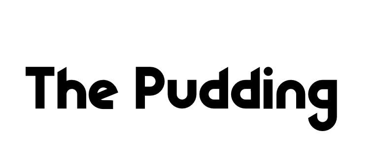 OK, so take that inspiration and run with it. Throw it at the gnarly ideas debated in our culture. Use good data. Make great images, maybe. Be funny. OK – now use data, images and humour, all in one. That’s The Pudding. The best internet rabbit hole, ever. You have been warned.
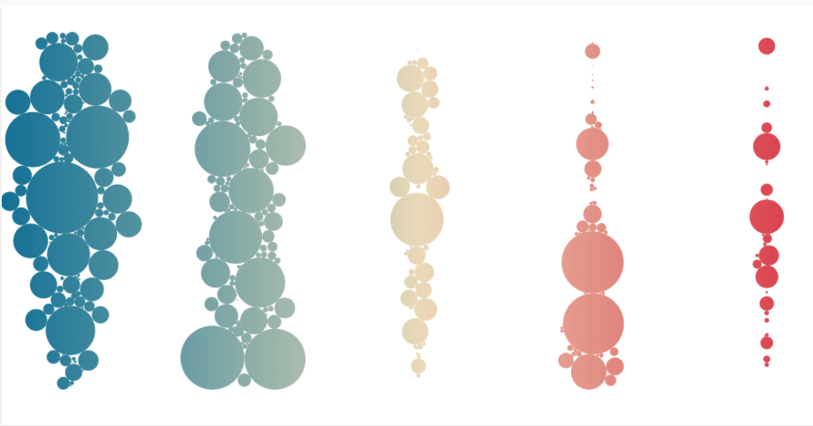
Though we think Nightingale may have loved Information is Beautiful. Distilling the world’s data, information and knowledge into beautiful infographics and visualisations.
Once you’ve seen it, you want to do it
Once you’ve seen it, you want to do it, right? So here’s a selection of tools and experiences to get you started, inspiring everything from mundane tasks to magical online storytelling. Selected because they harness not just creativity, but accessibility and community too.
Trello | Flip The Script Action Plan | When you see a beautiful cake, you want to eat it. And when you see a beautiful plan, you want to do it. Gantt charts – go sit in the corner.
Prezi | ‘UX Design for Product Managers’ |You bring the story – Prezi adds the experience. So not PowerPoint.
Shorthand | Story Gallery | Let’s you create highly visual web content, editorials, reports, proposals, and more. No web design skills required.
Let’s grab some more inspiration
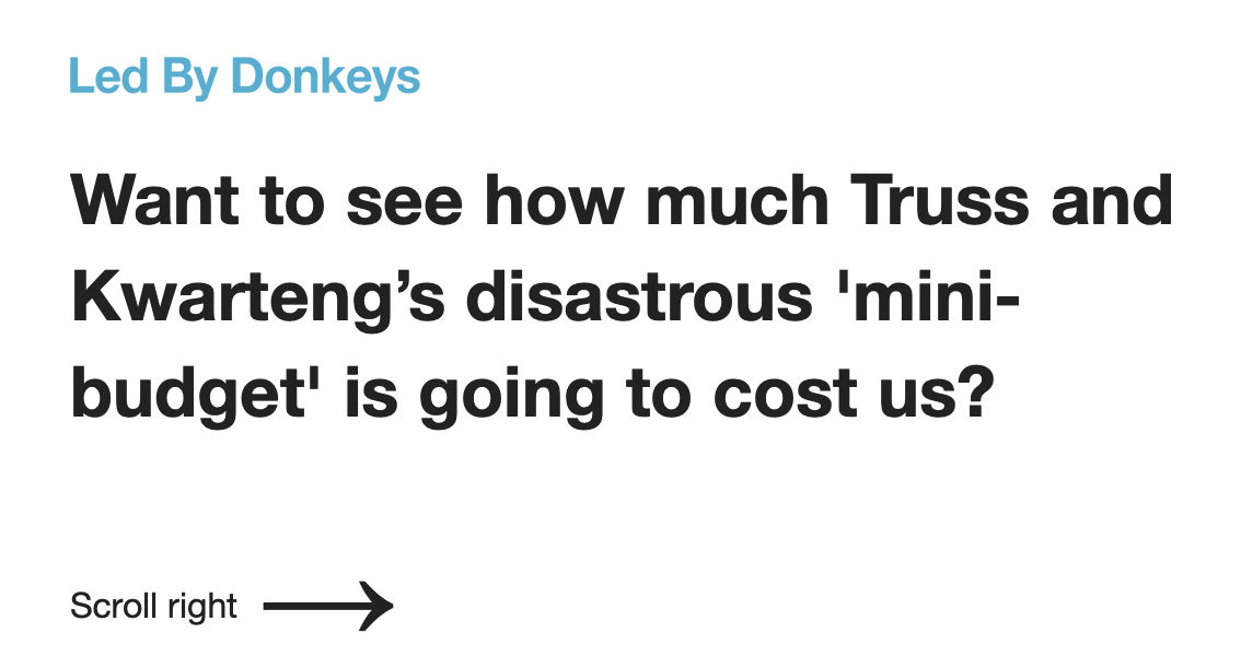 When it comes to speaking truth to power, maybe no one does it like Led By Donkeys. This data-driven visualisation of Liz Truss’s disastrous budget is genius.
And what about immersive experiences? Mountains of words have been written about the effects of climate change, but is it more powerful to show those effects in action, like this exhibition?
And illustration, and soundscapes, and film, and music without lyrics, and dance, and picture books. So many ways that stories can connect powerfully because of the absence of words.
Here’s ‘old media’ surpassing new
The New York Times combines its famous editorial with multimedia storytelling. First up, The Avalanche at Funnel Creek retells the real life drama of a skier, caught in a deadly avalanche. And in The 1619 project – the date marking the beginning of slavery in the United States – the paper reframes the nation’s history by placing the consequences of slavery and the contributions of black Americans at the centre of an ongoing, national narrative.
One last thing…
We hope we’ve inspired you to try some wordless storytelling. If you wanted just one place to begin your journey, maybe it’s here.
Visualising Data | A blog, a podcast, training and lots of other useful resources
We’re excited by the opportunity to co-create stories with you. When we mingle our skills and experience, great things can happen. Explore our resource of guides and blogs. And hit us up on the links below if you’re interested in understanding how you can plan, co-create and use content to tell your story.

What do you think?